说明 引入Volantis标签外挂大体上说有两种方法
通过插件引入
通过修改源码引入
以上两种方法均会出现不兼容的情况,需酌情处理,建议通过安装插件的方式引入
除特别说明外,本文中的标签外挂均来自于Volantis主题
前置步骤 插件法 复制Tag_Plugins源码 复制Volantis源码 此方法来自于基于Butterfly的外挂标签引入
安装hexo-butterfly-tag-plugins-plus插件
1 npm install hexo-butterfly-tag-plugins-plus --save
考虑到 hexo 自带的 markdown 渲染插件 hexo-renderer-marked 与外挂标签语法的兼容性较差,建议您将其替换成 hexo-renderer-kramed
1
2
npm uninstall hexo-renderer-marked --save npm install hexo-renderer-kramed --save
在站点配置文件_config.yml添加
1
2
3
4
5
6
7
8
kramed: gfm: true pedantic: false sanitize: false tables: true breaks: true smartLists: true smartypants: true
在站点配置文件_config.yml或主题配置文件_config.butterfly.yml 中添加
1
2
3
4
5
6
7
8
9
10
11
12
13
tag_plugins: enable: true priority: 5 issues: false link: placeholder: /img/link.png CDN: anima: https://npm.elemecdn.com/hexo-butterfly-tag-plugins-plus@latest/lib/assets/font-awesome-animation.min.css jquery: https://npm.elemecdn.com/jquery@latest/dist/jquery.min.js issues: https://npm.elemecdn.com/hexo-butterfly-tag-plugins-plus@latest/lib/assets/issues.js iconfont: //at.alicdn.com/t/font_2032782_8d5kxvn09md.js carousel: https://npm.elemecdn.com/hexo-butterfly-tag-plugins-plus@latest/lib/assets/carousel-touch.js tag_plugins_css: https://npm.elemecdn.com/hexo-butterfly-tag-plugins-plus@latest/lib/tag_plugins.css
下载hexo-theme-volantis 主题源码,找到/scripts/tags,将其中的js文件复制到[你的博客根目录]/themes/butterfly/scripts/tag/路径下(其他主题也是这个原理),根据名称添加你想要的标签外挂。保留原主题文件/覆盖原主题文件
在本文所引用的Volantis标签外挂中,4.0.0以上版本大部分均已失效,3.8.4版本经测试text部分不兼容、inlineimage不兼容、video不兼容
本博客通过安装插件的方式引入,在butterfly主题升级到4.0.1之前(3.8.4)采用复制Volantis源码的方式,但升级之后出现了不兼容的问题,故采用了基于Butterfly的外挂标签引入 的方法。
Volantis标签外挂 行内文本样式text 1 2 3 4 5 6 {% u 文本内容 %} {% emp 文本内容 %} {% wavy 文本内容 %} {% del 文本内容 %} {% kbd 文本内容 %} {% psw 文本内容 %}
1 2 3 4 5 6 1. 带 {% u 下划线 %} 的文本2. 带 {% emp 着重号 %} 的文本3. 带 {% wavy 波浪线 %} 的文本4. 带 {% del 删除线 %} 的文本5. 键盘样式的文本 {% kbd command %} + {% kbd D %}6. 密码样式的文本:{% psw 这里没有验证码 %}
带 下划线 的文本
带 着重号 的文本
带 波浪线 的文本
带 删除线 的文本
键盘样式的文本 command + D
密码样式的文本:这里没有验证码
行内文本span 1 {% span 样式参数(参数以空格划分), 文本内容 %}
参数
样式
字体
logo, code
颜色
red,yellow,green,cyan,blue,gray
大小
small, h4, h3, h2, h1, large, huge, ultra
对齐方向
left, center, right
1 2 3 4 5 6 - 彩色文字在一段话中方便插入各种颜色的标签,包括:{% span red, 红色 %}、{% span yellow, 黄色 %}、{% span green, 绿色 %}、{% span cyan, 青色 %}、{% span blue, 蓝色 %}、{% span gray, 灰色 %}。 - 超大号文字文档「开始」页面中的标题部分就是超大号文字。 {% span center logo large, Volantis %} {% span center small, A Wonderful Theme for Hexo %}
彩色文字红色 、黄色 、绿色 、青色 、蓝色 、灰色 。
超大号文字Volantis A Wonderful Theme for Hexo
段落文本p 1 {% p 样式参数(参数以空格划分), 文本内容 %}
参数
样式
字体
logo, code
颜色
red,yellow,green,cyan,blue,gray
大小
small, h4, h3, h2, h1, large, huge, ultra
对齐方向
left, center, right
1
2
3
4
5
6
- 彩色文字在一段话中方便插入各种颜色的标签,包括:{% p red, 红色 %}{% p yellow, 黄色 %}{% p green, 绿色 %}{% p cyan, 青色 %}{% p blue, 蓝色 %}{% p gray, 灰色 %} - 超大号文字文档「开始」页面中的标题部分就是超大号文字。 {% p center logo large, Volantis %} {% p center small, A Wonderful Theme for Hexo %}
单选列表 radio 1 {% radio 样式参数(可选), 文本(支持简单md) %}
参数
样式
颜色
red,yellow,green,cyan,blue,gray
选中状态
checked
1 2 3 4 5 6 7 {% radio 纯文本测试 %} {% radio checked, 支持简单的 [markdown ](https://guides.github.com/features/mastering-markdown/ ) 语法 %} {% radio red, 支持自定义颜色 %} {% radio green, 绿色 %} {% radio yellow, 黄色 %} {% radio cyan, 青色 %} {% radio blue, 蓝色 %}
复选列表 checkbox 1 {% checkbox 样式参数(可选), 文本(支持简单md) %}
参数
样式
样式
plus, minus, times
颜色
red,yellow,green,cyan,blue,gray
选中状态
checked
1 2 3 4 5 6 7 8 9 10 {% checkbox 纯文本测试 %} {% checkbox checked, 支持简单的 [markdown ](https://guides.github.com/features/mastering-markdown/ ) 语法 %} {% checkbox red, 支持自定义颜色 %} {% checkbox green checked, 绿色 + 默认选中 %} {% checkbox yellow checked, 黄色 + 默认选中 %} {% checkbox cyan checked, 青色 + 默认选中 %} {% checkbox blue checked, 蓝色 + 默认选中 %} {% checkbox plus green checked, 增加 %} {% checkbox minus yellow checked, 减少 %} {% checkbox times red checked, 叉 %}
链接卡片 link 1 {% link 标题, 链接, 图片链接(可选) %}
1 {% link Falling42のBlog, https://blog.falling42.net/, https://cdn.jsdelivr.net/gh/Falling42/CDN@R9/MyPictures/logo3.png %}
富文本按钮 btns 1 2 3 4 {% btns 样式参数 %} {% cell 标题, 链接, 图片或者图标 %} {% cell 标题, 链接, 图片或者图标 %} {% endbtns %}
如果需要显示类似「团队成员」之类的一组含有头像的链接:1 2 3 4 5 6 7 {% btns circle grid5 %} {% cell xaoxuu, https://xaoxuu.com, https://cdn.jsdelivr.net/gh/xaoxuu/cdn-assets/avatar/avatar.png %} {% cell xaoxuu, https://xaoxuu.com, https://cdn.jsdelivr.net/gh/xaoxuu/cdn-assets/avatar/avatar.png %} {% cell xaoxuu, https://xaoxuu.com, https://cdn.jsdelivr.net/gh/xaoxuu/cdn-assets/avatar/avatar.png %} {% cell xaoxuu, https://xaoxuu.com, https://cdn.jsdelivr.net/gh/xaoxuu/cdn-assets/avatar/avatar.png %} {% cell xaoxuu, https://xaoxuu.com, https://cdn.jsdelivr.net/gh/xaoxuu/cdn-assets/avatar/avatar.png %} {% endbtns %}
1 2 3 4 {% btns rounded grid5 %} {% cell 下载源码, /, fas fa-download %} {% cell 查看文档, /, fas fa-book-open %} {% endbtns %}
1 2 3 4 5 6 7 8 9 10 11 12 13 14 {% btns circle center grid5 %} <a href ='https://apps.apple.com/cn/app/heart-mate-pro-hrm-utility/id1463348922?ls=1' > <i class ='fab fa-apple' > </i > <b > </b > {% p red, 专业版 %} <img src ='https://cdn.jsdelivr.net/gh/xaoxuu/cdn-assets/qrcode/heartmate_pro.png' > </a > <a href ='https://apps.apple.com/cn/app/heart-mate-lite-hrm-utility/id1475747930?ls=1' > <i class ='fab fa-apple' > </i > <b > </b > {% p green, 免费版 %} <img src ='https://cdn.jsdelivr.net/gh/xaoxuu/cdn-assets/qrcode/heartmate_lite.png' > </a > {% endbtns %}
如果需要显示类似「团队成员」之类的一组含有头像的链接:
或者含有图标的按钮:
圆形图标 + 标题 + 描述 + 图片 + 网格 5 列 + 居中
github 卡片 ghcard 1 2 {% ghcard 用户名, 其它参数(可选) %} {% ghcard 用户名/仓库, 其它参数(可选) %}
更多参数可以参考:
参数名
取值
释义
hide
stars,commits,prs,issues,contribs
隐藏指定统计
count_private
true
将私人项目贡献添加到总提交计数中
show_icons
true
显示图标
theme
请查阅 Available Themes
主题
1 2 3 4 5 6 7 8 9 10 11 12 用户信息卡片 | {% ghcard xaoxuu %} | {% ghcard xaoxuu, theme=vue %} | | -- | -- | | {% ghcard xaoxuu, theme=buefy %} | {% ghcard xaoxuu, theme=solarized-light %} | | {% ghcard xaoxuu, theme=onedark %} | {% ghcard xaoxuu, theme=solarized-dark %} | | {% ghcard xaoxuu, theme=algolia %} | {% ghcard xaoxuu, theme=calm %} | 仓库信息卡片 | {% ghcard volantis-x/hexo-theme-volantis %} | {% ghcard volantis-x/hexo-theme-volantis, theme=vue %} | | -- | -- | | {% ghcard volantis-x/hexo-theme-volantis, theme=buefy %} | {% ghcard volantis-x/hexo-theme-volantis, theme=solarized-light %} | | {% ghcard volantis-x/hexo-theme-volantis, theme=onedark %} | {% ghcard volantis-x/hexo-theme-volantis, theme=solarized-dark %} | | {% ghcard volantis-x/hexo-theme-volantis, theme=algolia %} | {% ghcard volantisx/hexo-theme-volantis, theme=calm %} |
github 徽标 ghbdage 1 {% bdage [right],[left],[logo]||[color],[link],[title]||[option] %}
left:徽标左边的信息,必选参数。right: 徽标右边的信息,必选参数,logo:徽标图标,图标名称详见 simpleicons ,可选参数。color:徽标右边的颜色,可选参数。link:指向的链接,可选参数。title:徽标的额外信息,可选参数。主要用于优化 SEO,但 object 标签不会像 a 标签一样在鼠标悬停显示 title 信息。option:自定义参数,支持 shields.io 的全部 API 参数支持,具体参数可以参看上文中的拓展写法示例。形式为 name1=value2&name2=value2。 本外挂标签的参数分为三组,用 || 分割。1 2 {% bdage Theme,Butterfly %} {% bdage Frame,Hexo,hexo %}
信息参数,定义徽标右侧内容背景色,指向链接1 2 3 {% bdage CDN,JsDelivr,jsDelivr||abcdef,https://metroui.org.ua/index.html,本站使用JsDelivr为静态资源提供CDN加速 %} //如果是跨顺序省略可选参数,仍然需要写个逗号,用作分割 {% bdage Source,GitHub,GitHub||,https://github.com/ %}
拓展参数,支持 shields 的 API 的全部参数内容1 2 3 {% bdage Hosted,Vercel,Vercel||brightgreen,https://vercel.com/,本站采用双线部署,默认线路托管于Vercel||style=social&logoWidth=20 %} //如果是跨顺序省略可选参数组,仍然需要写双竖线||用作分割 {% bdage Hosted,Vercel,Vercel||||style=social&logoWidth=20&logoColor=violet %}
本外挂标签的参数分为三组,用 || 分割。
信息参数,定义徽标右侧内容背景色,指向链接
//如果是跨顺序省略可选参数,仍然需要写个逗号,用作分割
拓展参数,支持 shields 的 API 的全部参数内容
//如果是跨顺序省略可选参数组,仍然需要写双竖线||用作分割
网站卡片 sites 1 2 3 4 {% sitegroup %} {% site 标题, url=链接, screenshot=截图链接, avatar=头像链接(可选), description=描述(可选) %} {% site 标题, url=链接, screenshot=截图链接, avatar=头像链接(可选), description=描述(可选) %} {% endsitegroup %}
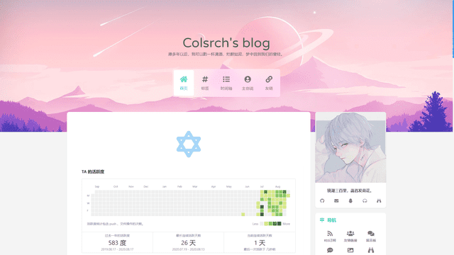
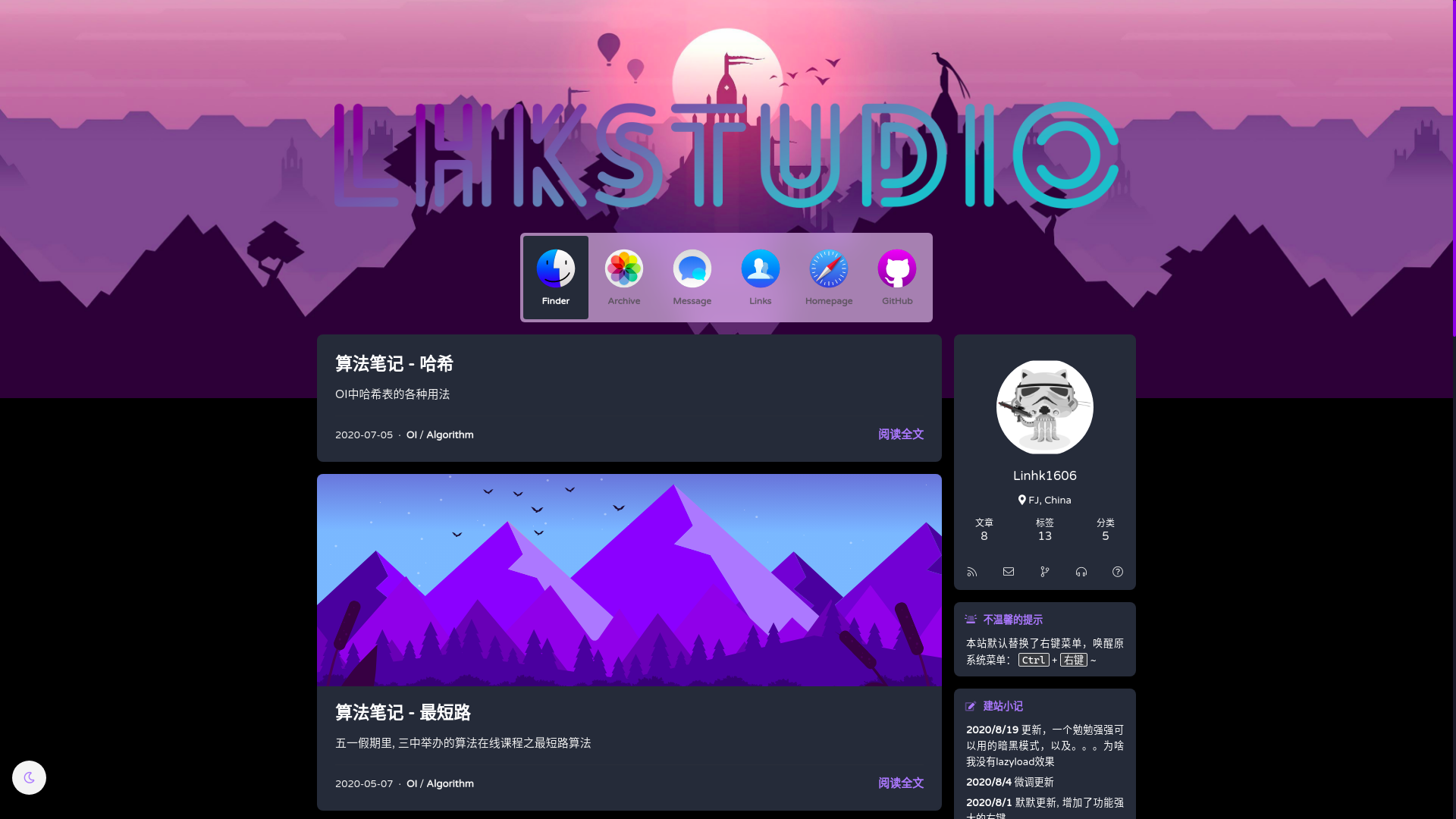
1
2
3
4
5
6
7
{% sitegroup %} {% site xaoxuu, url=https://xaoxuu.com, screenshot=https://i.loli.net/2020/08/21/VuSwWZ1xAeUHEBC.jpg, avatar=https://cdn.jsdelivr.net/gh/xaoxuu/cdn-assets/avatar/avatar.png, description=简约风格 %} {% site inkss, url=https://inkss.cn, screenshot=https://i.loli.net/2020/08/21/Vzbu3i8fXs6Nh5Y.jpg, avatar=https://cdn.jsdelivr.net/gh/inkss/common@master/static/web/avatar.jpg, description=这是一段关于这个网站的描述文字 %} {% site MHuiG, url=https://blog.mhuig.top, screenshot=https://i.loli.net/2020/08/22/d24zpPlhLYWX6D1.png, avatar=https://cdn.jsdelivr.net/gh/MHuiG/imgbed@master/data/p.png, description=这是一段关于这个网站的描述文字 %} {% site Colsrch, url=https://colsrch.top, screenshot=https://i.loli.net/2020/08/22/dFRWXm52OVu8qfK.png, avatar=https://cdn.jsdelivr.net/gh/Colsrch/images/Colsrch/avatar.jpg, description=这是一段关于这个网站的描述文字 %} {% site Linhk1606, url=https://linhk1606.github.io, screenshot=https://i.loli.net/2020/08/21/3PmGLCKicnfow1x.png, avatar=https://i.loli.net/2020/02/09/PN7I5RJfFtA93r2.png, description=这是一段关于这个网站的描述文字 %} {% endsitegroup %}
行内图片 inlineimage 这里与butterfly内置的inlineImg作用相同,不起冲突
1 {% inlineimage 图片链接, height=高度(可选) %} #高度:height=20px
1 2 3 这是 {% inlineimage https://cdn.jsdelivr.net/gh/volantis-x/cdn-emoji/aru-l/0000.gif %} 一段话。 这又是 {% inlineimage https://cdn.jsdelivr.net/gh/volantis-x/cdn-emoji/aru-l/5150.gif, height=40px %} 一段话。
这是
这又是
单张图片 image 1 {% image 链接, width=宽度(可选), height=高度(可选), alt=描述(可选), bg=占位颜色(可选) %}
图片宽度高度:width=300px, height=32px
图片描述:alt = 图片描述(butterfly 需要在主题配置文件中开启图片描述)
占位背景色:bg=#f2f2f2
1 2 3 4 5 6 7 8 添加描述: {% image https://cdn.jsdelivr.net/gh/volantis-x/cdn-wallpaper-minimalist/2020/025.jpg, alt=每天下课回宿舍的路,没有什么故事。 %} 指定宽度: {% image https://cdn.jsdelivr.net/gh/volantis-x/cdn-wallpaper-minimalist/2020/025.jpg, width=400px %} 指定宽度并添加描述: {% image https://cdn.jsdelivr.net/gh/volantis-x/cdn-wallpaper-minimalist/2020/025.jpg, width=400px, alt=每天下课回宿舍的路,没有什么故事。 %} 设置占位背景色: {% image https://cdn.jsdelivr.net/gh/volantis-x/cdn-wallpaper-minimalist/2020/025.jpg, width=400px, bg=#1D0C04, alt=优化不同宽度浏览的观感 %}
添加描述:
指定宽度:
指定宽度并添加描述:
设置占位背景色:
音频 audio
图片宽度高度:width=300px, height=32px
图片描述:alt = 图片描述(butterfly 需要在主题配置文件中开启图片描述)
占位背景色:bg=#f2f2f2
1 {% audio https://github.com/volantis-x/volantis-docs/releases/download/assets/Lumia1020.mp3 %}
Your browser does not support the audio tag. 视频 video
对其方向:left, center, right
列数:逗号后面直接写列数,支持 1 ~ 4 列。
1 2 3 4 5 6 7 8 9 10 11 12 13 14 15 16 17 18 19 20 00% 宽度 {% video https://github.com/volantis-x/volantis-docs/releases/download/assets/IMG_0341.mov %} 50% 宽度 {% videos, 2 %} {% video https://github.com/volantis-x/volantis-docs/releases/download/assets/IMG_ 0341.mov %}{% video https://github.com/volantis-x/volantis-docs/releases/download/assets/IMG_0341.mov %} {% video https://github.com/volantis-x/volantis-docs/releases/download/assets/IMG_ 0341.mov %}{% video https://github.com/volantis-x/volantis-docs/releases/download/assets/IMG_0341.mov %} {% endvideos %} 25% 宽度 {% videos, 4 %} {% video https://github.com/volantis-x/volantis-docs/releases/download/assets/IMG_ 0341.mov %}{% video https://github.com/volantis-x/volantis-docs/releases/download/assets/IMG_0341.mov %} {% video https://github.com/volantis-x/volantis-docs/releases/download/assets/IMG_ 0341.mov %}{% video https://github.com/volantis-x/volantis-docs/releases/download/assets/IMG_0341.mov %} {% video https://github.com/volantis-x/volantis-docs/releases/download/assets/IMG_ 0341.mov %}{% video https://github.com/volantis-x/volantis-docs/releases/download/assets/IMG_0341.mov %} {% video https://github.com/volantis-x/volantis-docs/releases/download/assets/IMG_ 0341.mov %}{% video https://github.com/volantis-x/volantis-docs/releases/download/assets/IMG_0341.mov %} {% endvideos %}
00% 宽度
Your browser does not support the video tag.
50% 宽度
Your browser does not support the video tag.
Your browser does not support the video tag.
Your browser does not support the video tag.
Your browser does not support the video tag.
25% 宽度
Your browser does not support the video tag.
Your browser does not support the video tag.
Your browser does not support the video tag.
Your browser does not support the video tag.
Your browser does not support the video tag.
Your browser does not support the video tag.
Your browser does not support the video tag.
Your browser does not support the video tag.
折叠框 folding Butterfly 虽然也有内置折叠框 hideToggle 标签,但是 Volantis 的 folding 折叠框更好看一些。
1 2 3 {% folding 参数(可选), 标题 %}  {% endfolding %}
颜色:blue, cyan, green, yellow, red
状态:状态填写 open 代表默认打开。
1 2 3 4 5 6 7 8 9 10 11 12 13 14 15 16 17 18 19 20 21 22 23 24 25 26 27 28 29 30 31 32 33 34 35 36 {% folding 查看图片测试 %}  {% endfolding %} {% folding cyan open, 查看默认打开的折叠框 %} 这是一个默认打开的折叠框。 {% endfolding %} {% folding green, 查看代码测试 %} 假装这里有代码块(代码块没法嵌套代码块) {% endfolding %} {% folding yellow, 查看列表测试 %} - haha- hehe{% endfolding %} {% folding red, 查看嵌套测试 %} {% folding blue, 查看嵌套测试2 %} {% folding 查看嵌套测试3 %} hahaha <span > <img src ='https://cdn.jsdelivr.net/gh/volantis-x/cdn-emoji/tieba/%E6%BB%91%E7%A8%BD.png' style ='height:24px' > </span > {% endfolding %} {% endfolding %} {% endfolding %}
查看图片测试
查看默认打开的折叠框
查看代码测试
查看列表测试
查看嵌套测试
查看嵌套测试2 查看嵌套测试3 hahaha
其他标签外挂
上标标签 tip 1 {% tip [参数,可选] %}文本内容{% endtip %}{% radio 样式参数(可选), 文本(支持简单md) %}
参数
样式
样式
success,error,warning,bolt,ban,home,sync,cogs,key,bell
自定义图标
支持 fontawesome
1 2 3 4 5 6 7 8 9 10 11 12 {% tip %}默认情况{% endtip %} {% tip success %}success{% endtip %} {% tip error %}error{% endtip %} {% tip warning %}warning{% endtip %} {% tip bolt %}bolt{% endtip %} {% tip ban %}ban{% endtip %} {% tip home %}home{% endtip %} {% tip sync %}sync{% endtip %} {% tip cogs %}cogs{% endtip %} {% tip key %}key{% endtip %} {% tip bell %}bell{% endtip %} {% tip fa-atom %}自定义font awesome图标{% endtip %}
动态标签 anima 1 {% tip [参数,可选] %}文本内容{% endtip %}
更多详情请参看 font-awesome-animation 文档
将所需的 CSS 类添加到图标(或 DOM 中的任何元素)。faa-parent animated-hover。(详情见示例及示例源码)faa-fast 或 faa-slow 来控制动画快慢。
1 2 3 4 5 6 7 8 9 10 11 12 On DOM load(当页面加载时显示动画) {% tip warning faa-horizontal animated %}warning{% endtip %} {% tip ban faa-flash animated %}ban{% endtip %} 调整动画速度 {% tip warning faa-horizontal animated faa-fast %}warning{% endtip %} {% tip ban faa-flash animated faa-slow %}ban{% endtip %} On hover(当鼠标悬停时显示动画) {% tip warning faa-horizontal animated-hover %}warning{% endtip %} {% tip ban faa-flash animated-hover %}ban{% endtip %} On parent hover(当鼠标悬停在父级元素时显示动画) {% tip warning faa-parent animated-hover %}<p class ="faa-horizontal" > </p > {% tip ban faa-parent animated-hover %}<p class ="faa-flash" > </p >
On DOM load(当页面加载时显示动画)
调整动画速度
On hover(当鼠标悬停时显示动画)
On parent hover(当鼠标悬停在父级元素时显示动画)
注释 notation 1 {% nota [label] , [text] %}
label: 注释词汇text: 悬停显示的注解内容 1 {% nota 把鼠标移动到我上面试试 ,可以看到注解内容出现在顶栏 %}


 xaoxuu


 一段话。
一段话。 一段话。
一段话。